

Teachers Health Group
Teachers
Health
One eDM design system for three health fund brands, built after the Teachers Health Group rebrand.
Teachers Health Group runs three health funds: Teachers Health, Nurses & Midwives Health and UniHealth. After a recent rebrand, their emails needed to catch up, but there was no shared eDM library to build from.
The goal was one system all three brands could use, built so it could carry over to web as well.
My role
I designed all of the eDM components, from the colour and type foundations through to the module library. I worked with the team to get the system ready for handover, so new campaigns could be built from it straight away.
Discovery
The existing emails showed where the gaps were. Without a shared library, each send was designed on its own, and the new brand hadn’t made its way into the inbox yet.
Process
- No shared library, so every email started from a blank page.
- Three brands, but no way to reuse work between them.
- Spacing, buttons and type changed from send to send.
Design
- Emails still reflected the old look after the rebrand.
- Button colours weren’t tied to the new palette.
- Long, text-heavy layouts on mobile.
Design principles
These principles came straight out of the gaps in the old emails, and every module was checked against them.
Reusable: build a module once and use it in any email.
Consistent: the same spacing, type and buttons in every send.
Brand-flexible: one structure that takes on each brand’s look.
Mobile-first: designed for the small screen, then scaled up.
Accessible: readable text and clear contrast on every colour.
Build-ready: simple enough to hand straight to the build team.
Building the library
Every part of the email became its own module, from the hero and referral steps through to rewards, help and the footer. Modules stack in any order, so a new campaign is pieced together from parts instead of starting from a blank page.
One system, three brands
The same modules re-skin for Teachers Health, Nurses & Midwives Health and UniHealth. Layout, spacing and components stay the same; the logo, colour palette and imagery change for each brand.

Guidelines & handover
The guidelines document covers how to use each module, where it can sit in an email and the rules that keep it accessible. Designers and the developers building the emails work from the same source.

Next projects
See all works AMCSArt direction, Graphic design & Illustration
 TOSSRGraphic design & Digital
 Carnival Cruise LineIllustration, Graphic design & OOH
 Youth Off the StreetsOOH, Social & Digital
 Hurstville RadiologyBranding & Web design
 Late Night FriendsBranding & Art direction
Teachers HealtheDM design, Design systems & UI design
Get in touch
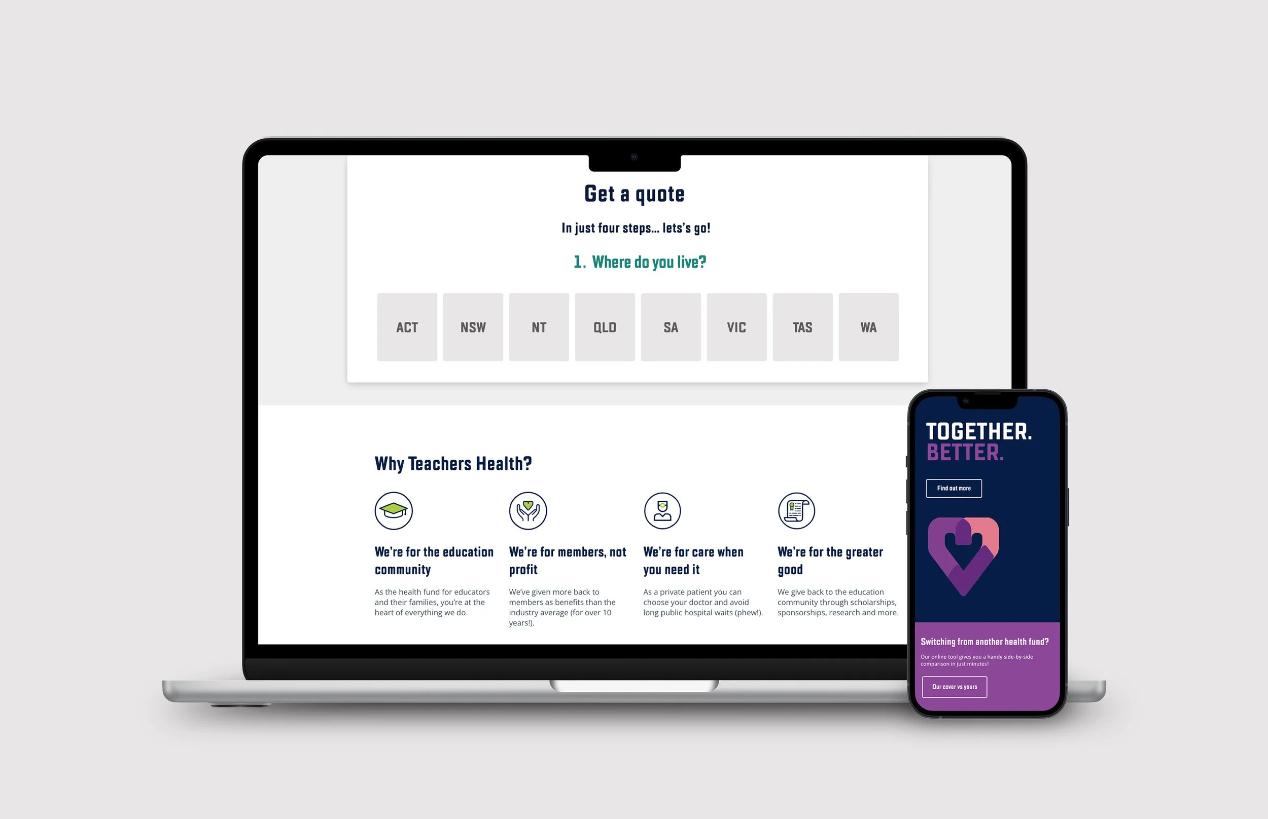
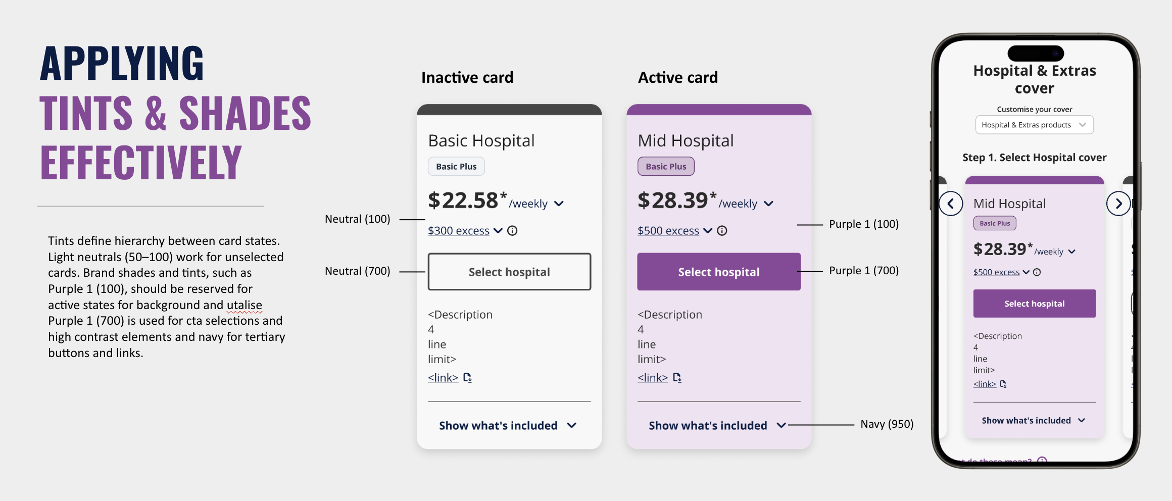
In 2025, Teachers Health and Teachers Union merged to form a unified health fund. With the merger came the need for a consistent, scalable UI kit to support the newly aligned brand and website experience.
A comprehensive design system was developed to unify visual language, improve usability, and ensure consistency across all digital touchpoints for Teachers health,
Nurses Health and Uni Health.
Teachers health
·
Teachers health ·
Teachers Health landing page.
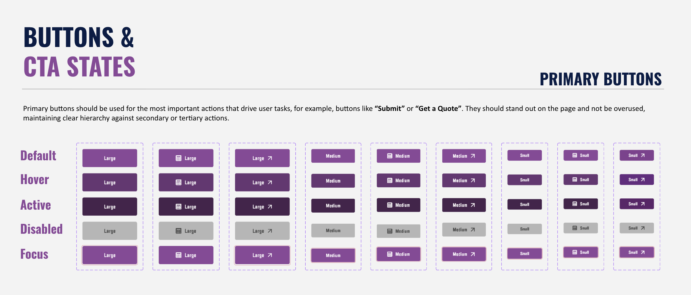
Nurses Health UI kit.
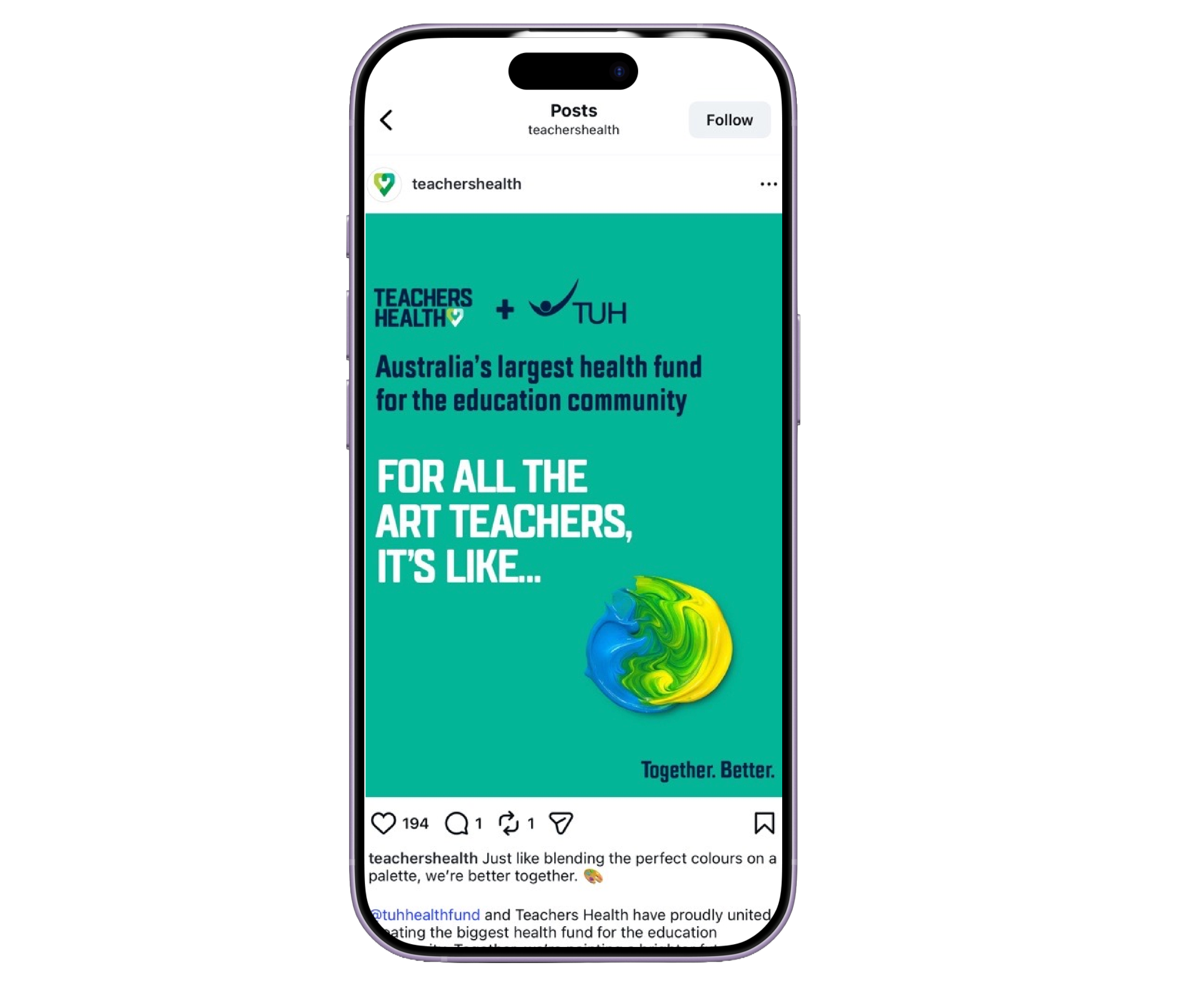
Teachers Health + Teachers Union merger.